Plots are important tools in data exploration, when you are first looking at your dataset and checking how data is distributed. It is also critical at a later stage, when you carefully design and customize figures to present your work in a talk or manuscript.
Today we will go over two sets of tools available for plotting in R: basic built-in functions, and a specific graphical package, ggplot2 (we will talk about packages in a minute).
In The R Graph Gallery, you will find beautiful plots that can serve as inspiration and reference for your own work. Another option are these Top 50 ggplot2 Visualizations.
Setup
First set your working directory:
setwd("/Users/tauanajc/TEACHING/2020_STRI_introR/L3_Graphs") # Type the path to your project folderInstall and load packages
R comes with many basic functions that we have already used. Many more functionalities are available through specific packages. These are sets of new R functions developed by the R community, accompanied by their own documentation (help pages). There are thousands of R packages that span a variety of purposes, for example to better manipulate data (dplyr), to plot phylogenetic trees (ggtree), to create websites (blogdown). Once you have installed a package, you can load it in your R session to make the new set of functions avalaible to you.
Let’s install the package that we will use later today, ggplot2 (remember that the package name is case sensitive):
install.packages("ggplot2") # Output omitted to keep the tutorial cleanAfter installing it, the package is now in your computer and you can delete the installation command from your script. For all future projects, you only need to load your installed package at the top of the script:
library(ggplot2)If a package has never been installed, you will get an error trying to load it:
library(ggrepel)## Error in library(ggrepel) : there is no package called ‘ggrepel’Import and manipulate a dataset
Let’s use the same dataset that Lee introduced in the previous class. Remember, this is an abbreviated dataset from Dietterich et al. 2017 Ecological Applications. In brief, Lee collected leaves, roots, and soils from many individuals of five plant species growing throughout a site contaminated with the heavy metals zinc, lead and cadmium. He investigated the relationships between the metal concentrations in the soil, root colonization by mycorrhizal fungi (AMF), and metal concentrations in the leaves. AMF is shown as percent of root length colonized, and metal concentrations in leaves and soils are in mg/kg.
Read data
heavy_metals <- read.csv(file = "Dietterich et al 2017 data for R course.csv")Let’s look at the first few rows of this dataset and also its structure:
head(heavy_metals)## Sample.id Species AMF Cd.leaf Pb.leaf Zn.leaf Cd.soil
## 1 AA57A AA 0.23157895 0.7783835 3.196124 123.6436 NA
## 2 AA57B AA 0.13402062 6.5385033 11.485826 415.3090 28.79344
## 3 AA64A AA 0.13483146 7.2124048 24.175478 283.9810 NA
## 4 AA64B AA 0.18705036 8.7516034 85.286755 427.9493 36.38013
## 5 AA65A AA 0.03370786 15.7864765 47.114983 899.6245 238.45015
## 6 AA65B AA 0.04000000 29.9806136 227.177291 802.0886 88.95300
## Pb.soil Zn.soil
## 1 54.66782 987.7696
## 2 344.56057 2637.6816
## 3 NA NA
## 4 1966.49775 3022.5225
## 5 931.60630 7681.7866
## 6 2997.54140 5212.4895str(heavy_metals)## 'data.frame': 124 obs. of 9 variables:
## $ Sample.id: chr "AA57A" "AA57B" "AA64A" "AA64B" ...
## $ Species : chr "AA" "AA" "AA" "AA" ...
## $ AMF : num 0.2316 0.134 0.1348 0.1871 0.0337 ...
## $ Cd.leaf : num 0.778 6.539 7.212 8.752 15.786 ...
## $ Pb.leaf : num 3.2 11.5 24.2 85.3 47.1 ...
## $ Zn.leaf : num 124 415 284 428 900 ...
## $ Cd.soil : num NA 28.8 NA 36.4 238.5 ...
## $ Pb.soil : num 54.7 344.6 NA 1966.5 931.6 ...
## $ Zn.soil : num 988 2638 NA 3023 7682 ...Change labels and codes
To make things more clear for us, let’s change the column names:
(Did you notice that, in the original version of this tutorial, two of the labels were accidentally misplaced? That has a tremendous impact on what you see in the analyses and plots, so always double check that labels are correct when replacing information!)
colnames(heavy_metals) <- c("SampleID", "Species", "Mycorrhizal_Colonization",
                            "Leaves_Cadmium", "Leaves_Lead", "Leaves_Zinc",
                            "Soil_Cadmium", "Soil_Lead", "Soil_Zinc")
Check how they are now:
head(heavy_metals)## SampleID Species Mycorrhizal_Colonization Leaves_Cadmium Leaves_Lead
## 1 AA57A AA 0.23157895 0.7783835 3.196124
## 2 AA57B AA 0.13402062 6.5385033 11.485826
## 3 AA64A AA 0.13483146 7.2124048 24.175478
## 4 AA64B AA 0.18705036 8.7516034 85.286755
## 5 AA65A AA 0.03370786 15.7864765 47.114983
## 6 AA65B AA 0.04000000 29.9806136 227.177291
## Leaves_Zinc Soil_Cadmium Soil_Lead Soil_Zinc
## 1 123.6436 NA 54.66782 987.7696
## 2 415.3090 28.79344 344.56057 2637.6816
## 3 283.9810 NA NA NA
## 4 427.9493 36.38013 1966.49775 3022.5225
## 5 899.6245 238.45015 931.60630 7681.7866
## 6 802.0886 88.95300 2997.54140 5212.4895Let’s also change the species codes, replacing them with the genus name:
# Create a vector with the genus names
genera <- c("Ageratina", "Deschampsia", "Eupatorium", "Minuartia", "Agrostis")
# Name the elements of this vector according to their code
names(genera) <- c("AA", "DF", "ES", "MP", "AP")
genera
## AA DF ES MP AP
## "Ageratina" "Deschampsia" "Eupatorium" "Minuartia" "Agrostis"# Let's try indexing the new genera object
genera[c("AA", "AA", "AA")] # We get 3 times the full genus name of code AA## AA AA AA
## "Ageratina" "Ageratina" "Ageratina"# Now let's give it the entire column of species
genera[heavy_metals$Species] # We get a new vector of all the genera names according to the code!## AA AA AA AA AA
## "Ageratina" "Ageratina" "Ageratina" "Ageratina" "Ageratina"
## AA AA AA AA AA
## "Ageratina" "Ageratina" "Ageratina" "Ageratina" "Ageratina"
## AA AA AA AA AA
## "Ageratina" "Ageratina" "Ageratina" "Ageratina" "Ageratina"
## AA AA AA AA AA
## "Ageratina" "Ageratina" "Ageratina" "Ageratina" "Ageratina"
## AA AA AA DF DF
## "Ageratina" "Ageratina" "Ageratina" "Deschampsia" "Deschampsia"
## DF DF DF DF DF
## "Deschampsia" "Deschampsia" "Deschampsia" "Deschampsia" "Deschampsia"
## DF DF DF DF DF
## "Deschampsia" "Deschampsia" "Deschampsia" "Deschampsia" "Deschampsia"
## DF DF DF DF DF
## "Deschampsia" "Deschampsia" "Deschampsia" "Deschampsia" "Deschampsia"
## DF ES ES ES ES
## "Deschampsia" "Eupatorium" "Eupatorium" "Eupatorium" "Eupatorium"
## ES ES ES ES ES
## "Eupatorium" "Eupatorium" "Eupatorium" "Eupatorium" "Eupatorium"
## ES ES ES ES ES
## "Eupatorium" "Eupatorium" "Eupatorium" "Eupatorium" "Eupatorium"
## ES ES ES ES ES
## "Eupatorium" "Eupatorium" "Eupatorium" "Eupatorium" "Eupatorium"
## ES ES MP MP MP
## "Eupatorium" "Eupatorium" "Minuartia" "Minuartia" "Minuartia"
## MP MP MP MP MP
## "Minuartia" "Minuartia" "Minuartia" "Minuartia" "Minuartia"
## MP MP MP MP MP
## "Minuartia" "Minuartia" "Minuartia" "Minuartia" "Minuartia"
## MP MP MP MP MP
## "Minuartia" "Minuartia" "Minuartia" "Minuartia" "Minuartia"
## MP MP MP MP MP
## "Minuartia" "Minuartia" "Minuartia" "Minuartia" "Minuartia"
## MP AP AP AP AP
## "Minuartia" "Agrostis" "Agrostis" "Agrostis" "Agrostis"
## AP AP AP AP AP
## "Agrostis" "Agrostis" "Agrostis" "Agrostis" "Agrostis"
## AP AP AP AP AP
## "Agrostis" "Agrostis" "Agrostis" "Agrostis" "Agrostis"
## AP AP AP AP AP
## "Agrostis" "Agrostis" "Agrostis" "Agrostis" "Agrostis"
## AP AP AP AP AP
## "Agrostis" "Agrostis" "Agrostis" "Agrostis" "Agrostis"
## AP AP AP AP AP
## "Agrostis" "Agrostis" "Agrostis" "Agrostis" "Agrostis"
## AP AP AP AP AP
## "Agrostis" "Agrostis" "Agrostis" "Agrostis" "Agrostis"
## AP AP AP AP
## "Agrostis" "Agrostis" "Agrostis" "Agrostis"# Use the command above to overwrite the content of the column Species
heavy_metals$Species <- genera[heavy_metals$Species]Check that this worked by looking at some random lines of the dataset. Use indexing to select just a few lines, and the first 5 columns:
heavy_metals[c(1,30,50,75,90), 1:5]## SampleID Species Mycorrhizal_Colonization Leaves_Cadmium Leaves_Lead
## 1 AA57A Ageratina 0.2315789 0.7783835 3.196124
## 30 DF57A Deschampsia NA 4.1212228 25.720846
## 50 H72B Eupatorium 0.1200000 67.3486260 119.868176
## 75 MP121x Minuartia 0.0000000 78.6864724 8.927673
## 90 Y57B Agrostis 0.0250000 9.8749091 12.273389Before plotting, let’s also change the Species column from character to factor:
heavy_metals$Species <- as.factor(heavy_metals$Species)
str(heavy_metals)
## 'data.frame': 124 obs. of 9 variables:
## $ SampleID : chr "AA57A" "AA57B" "AA64A" "AA64B" ...
## $ Species : Factor w/ 5 levels "Ageratina","Agrostis",..: 1 1 1 1 1 1 1 1 1 1 ...
## $ Mycorrhizal_Colonization: num 0.2316 0.134 0.1348 0.1871 0.0337 ...
## $ Leaves_Cadmium : num 0.778 6.539 7.212 8.752 15.786 ...
## $ Leaves_Lead : num 3.2 11.5 24.2 85.3 47.1 ...
## $ Leaves_Zinc : num 124 415 284 428 900 ...
## $ Soil_Cadmium : num NA 28.8 NA 36.4 238.5 ...
## $ Soil_Lead : num 54.7 344.6 NA 1966.5 931.6 ...
## $ Soil_Zinc : num 988 2638 NA 3023 7682 ...Finally, let’s plot some graphs!
Basic plots with built-in functions
First we will go over some of the most common plot types with built-in functions in R.
Histogram
This is a very standard type of plot, in which you can see the frequencies of values in your data. It automatically bins the data in ranges, but you can also customize the number of bins. To plot a histogram with base R we use the hist command.
Let’s look at the distribution of the zinc concentrations in the leaves of all plant species:
hist(x = heavy_metals$Leaves_Zinc)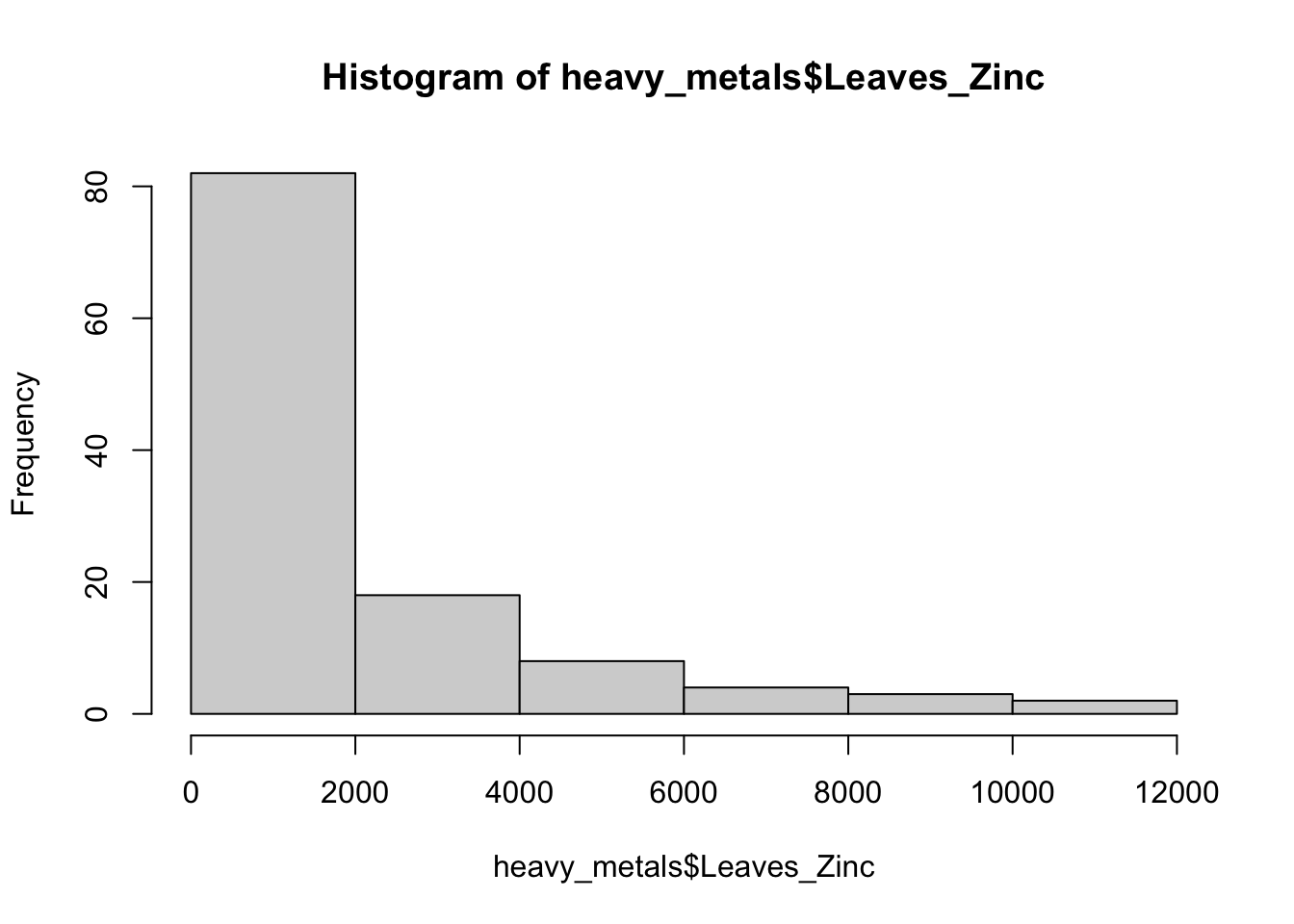
With more bins, we can better see the distribution of zinc concentrations, take a look below.
And you probably noticed that the names of the axis look terrible! You should always change them to informative names. Same goes for the title. Any of those can also be left blank.
hist(x = heavy_metals$Leaves_Zinc,
     breaks = 20, # Specify number of bins
     main = "", # Plot title
     xlab = "Zinc concentration in plant leaves (mg/kg)", # Axes labels
     ylab = "Frequency")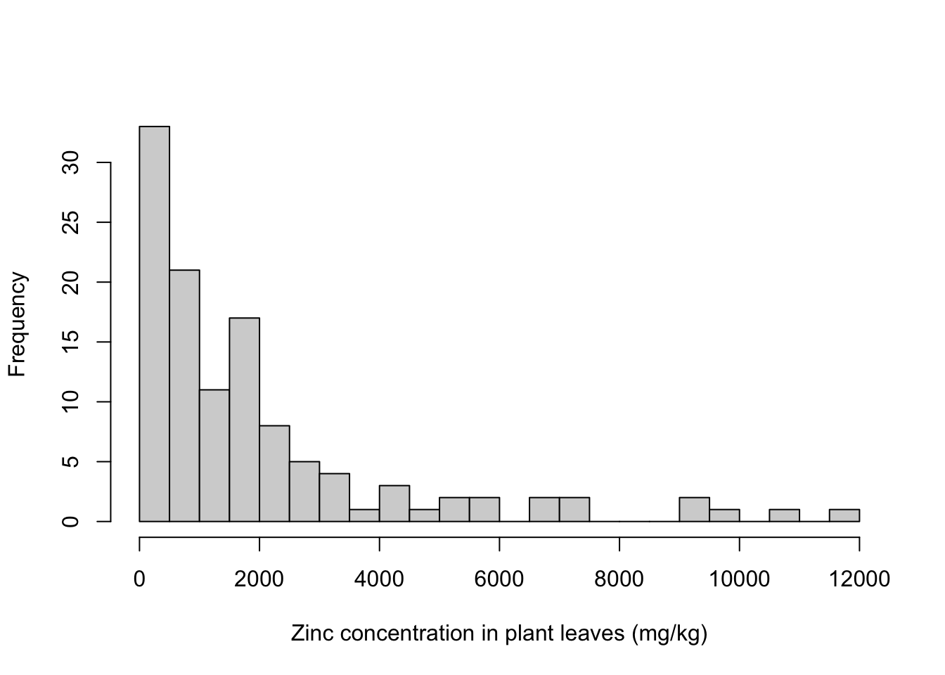
Much better!
Remember to use the help function whenever you want to see the other arguments and options for any command:
help(hist)
?hist
Boxplot
The boxplot summarizes the data, without having all data points in the graph. The lines of the box correspond to the median, quartiles, minimum and maximum values of the dataset. The spacing between the parts of the box reflect the amount of spread and skewness in the data. If present, outliers are usually plotted as dots/circles. The command here is easy to remember: boxplot.
Let’s get a boxplot for the exact same zinc concentrations that we used in the histogram:
boxplot(x = heavy_metals$Leaves_Zinc,
        ylab = "Zinc concentration in leaves (mg/kg)")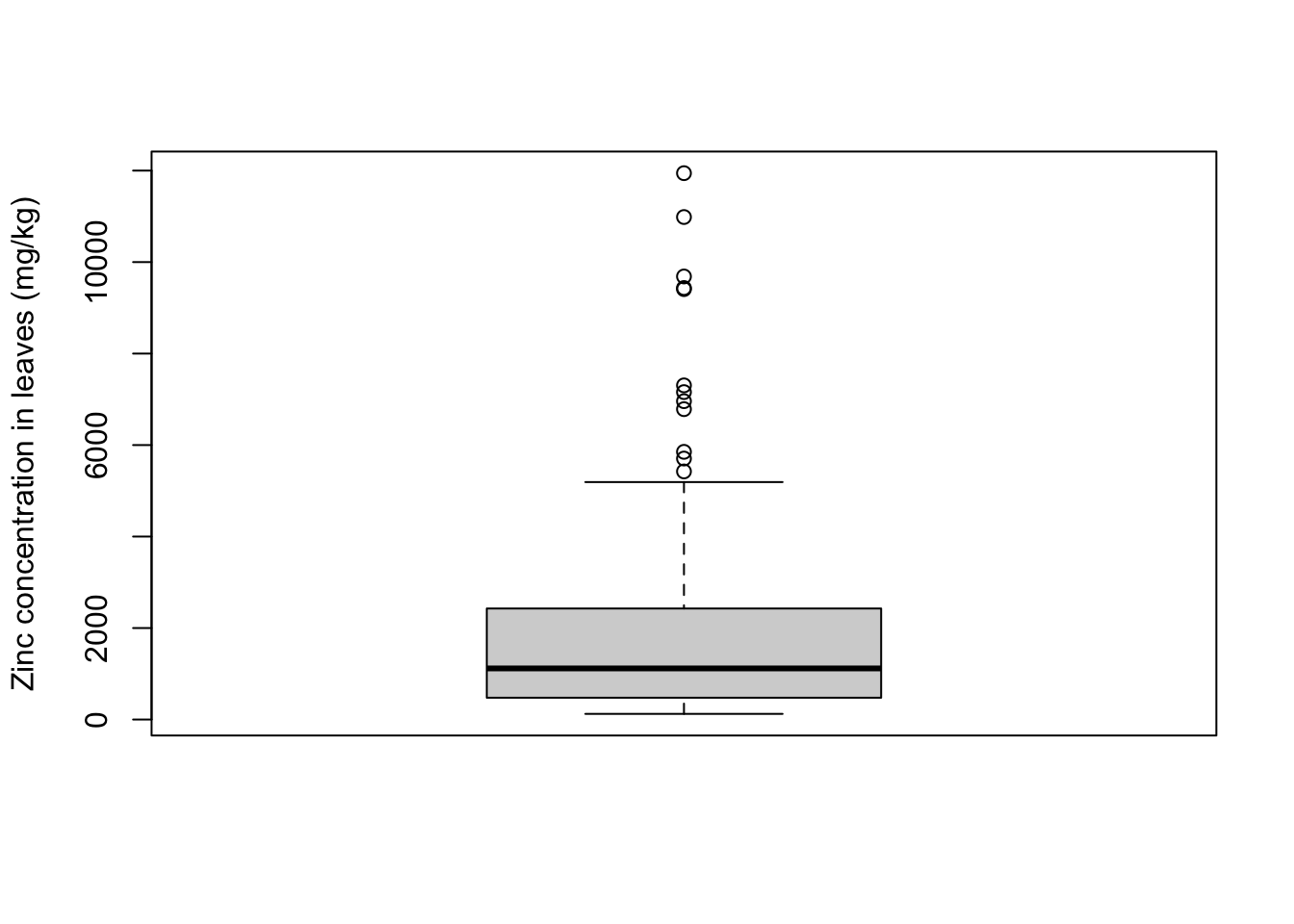
A bit more information on how to interpret boxplots:
- median: middle value of the ordered set, such that 50% of the values are smaller than the median and 50% are greater
- first quartile (Q1): value below which are 25% of the elements of the ordered set
- third quartile (Q2): value below which are 75% of the elements of the ordered set = above which are 25% of the elements
- maximum: largest number of the set (excluding outliers)
- minimum: smallest number of the set (excluding outliers)
- outliers: if present, these are values that are below Q1 or above Q3 by at least 1.5 times the interval between these two quartiles (interquantile range)
It would be more interesting to look at the distribution of zinc concentrations for each one of the individual plant species. The boxplot allows you to plot a separate box for each level of a factor - note that the arguments to specify the data are different:
boxplot(formula = Leaves_Zinc ~ Species,
        data = heavy_metals,
        ylab = "Zinc concentration in leaves (mg/kg)",
        xlab = "")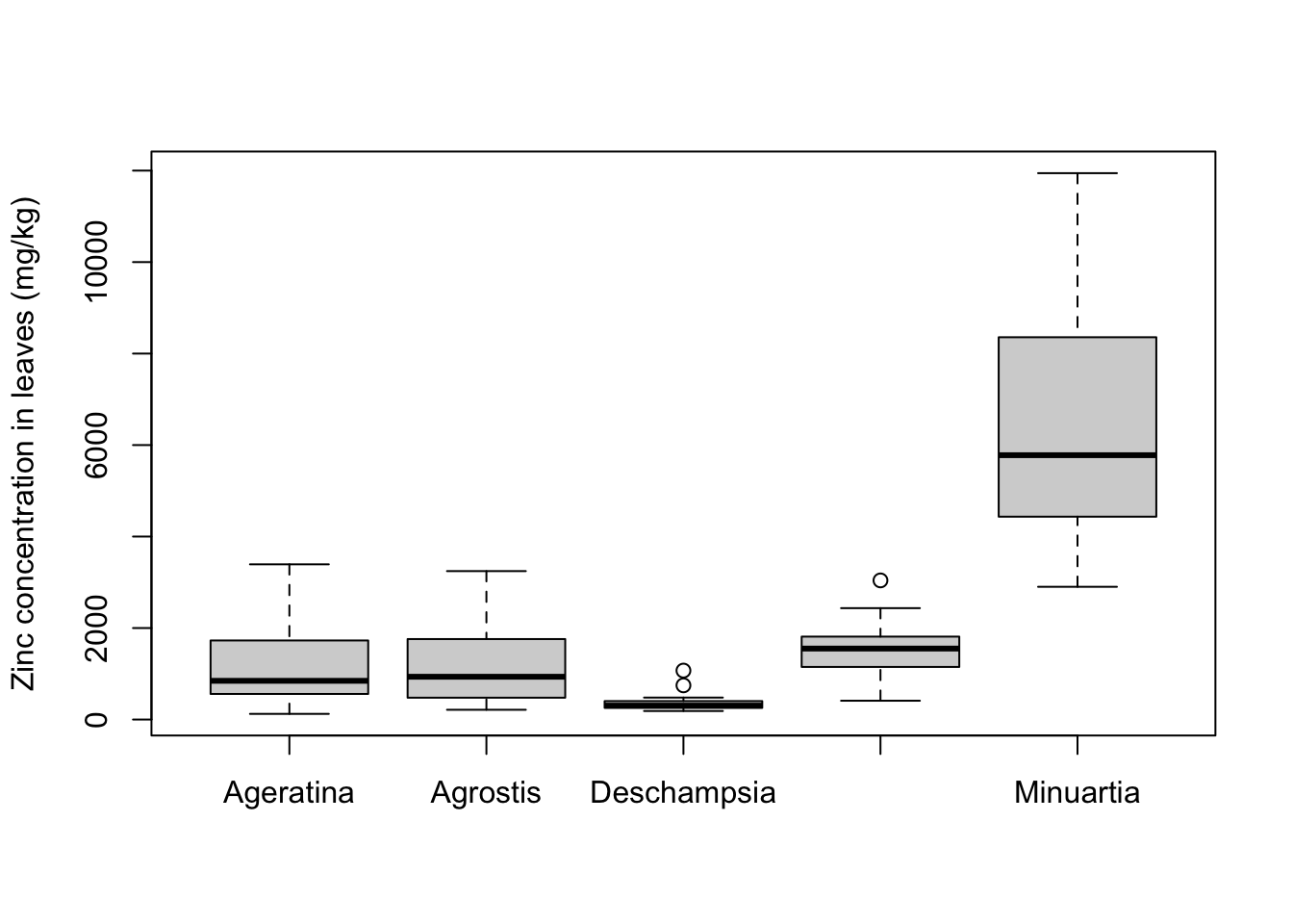
Scatter plot
Scatter plots are used to visualize the relationship between two variables. The command is plot.
Let’s try a scatter plot with our soil and leaf concentrations of zinc:
plot(formula = Leaves_Zinc ~ Soil_Zinc,
     data = heavy_metals,
     ylab = "Zinc concentration in leaves (mg/kg)",
     xlab = "Zinc concentration in soil (mg/kg)")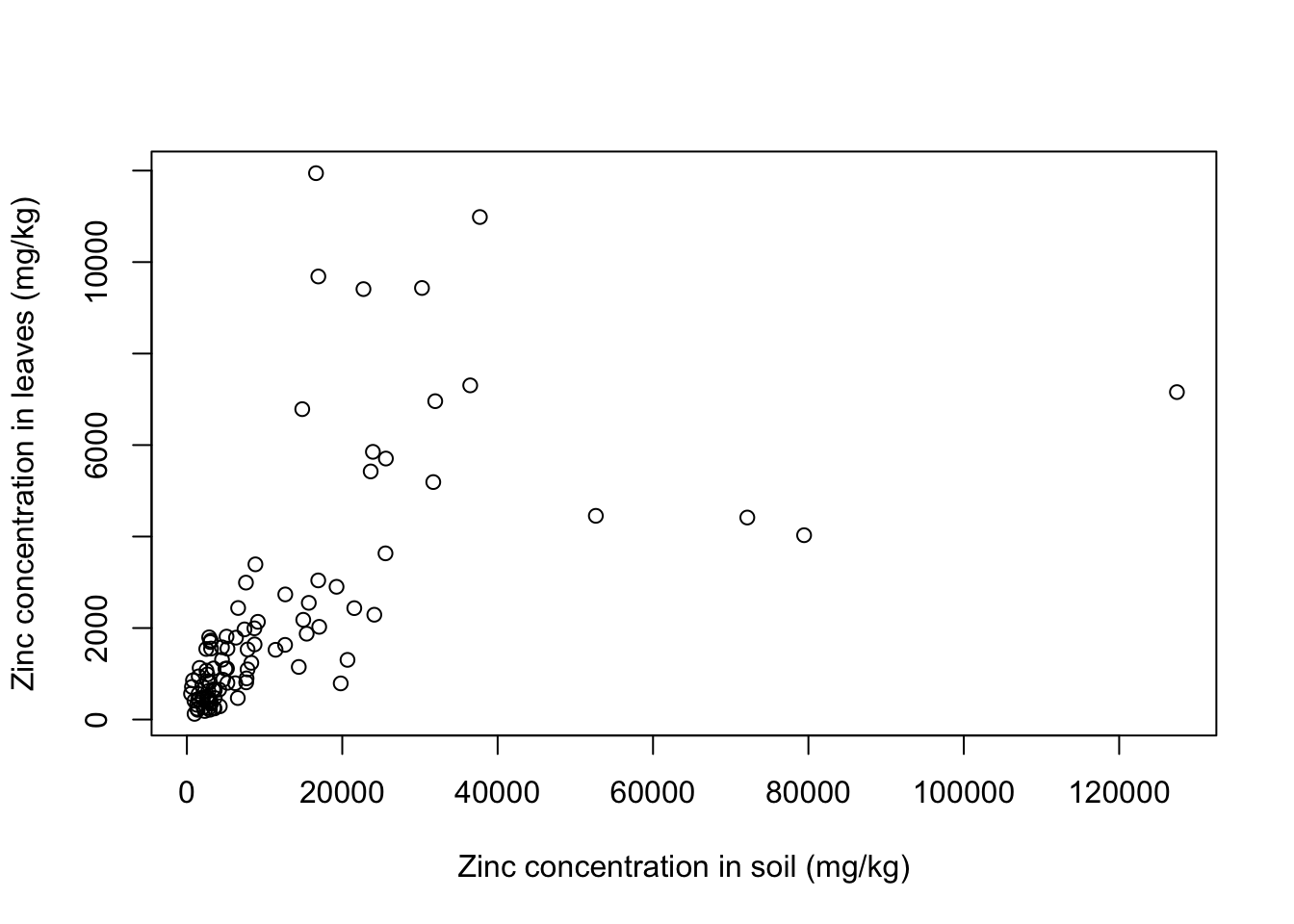
There seems to be a positive relationship betwen soil and leaf concentrations of zinc. What if we look at individual plant species? Let’s use a for loop to get a scatter plot for each of the plants:
for(i in 1:5){ # 5 species of plant
  each_plant = subset(x = heavy_metals,
                      subset = Species == levels(heavy_metals$Species)[i]) # subset for each species
  plot(formula = Leaves_Zinc ~ Soil_Zinc,
       data = each_plant, # plot variables for specific subset
       main = levels(heavy_metals$Species)[i], # title indexed to get species name
       ylab = "Zinc concentration in leaves (mg/kg)",
       xlab = "Zinc concentration in soil (mg/kg)")}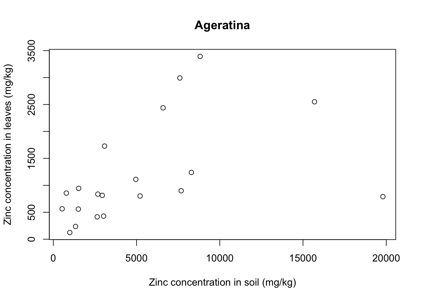
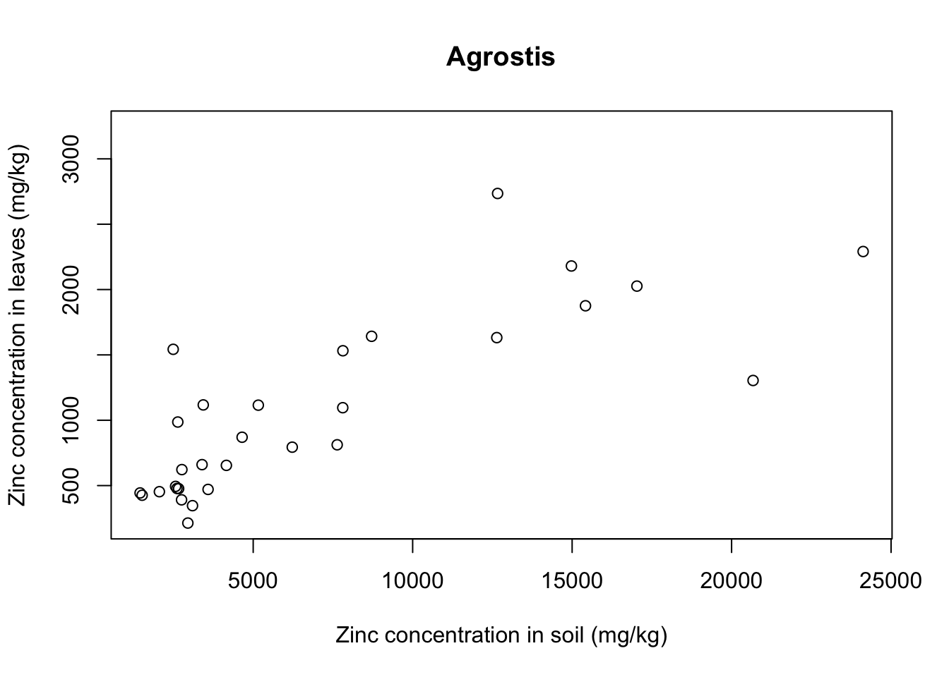
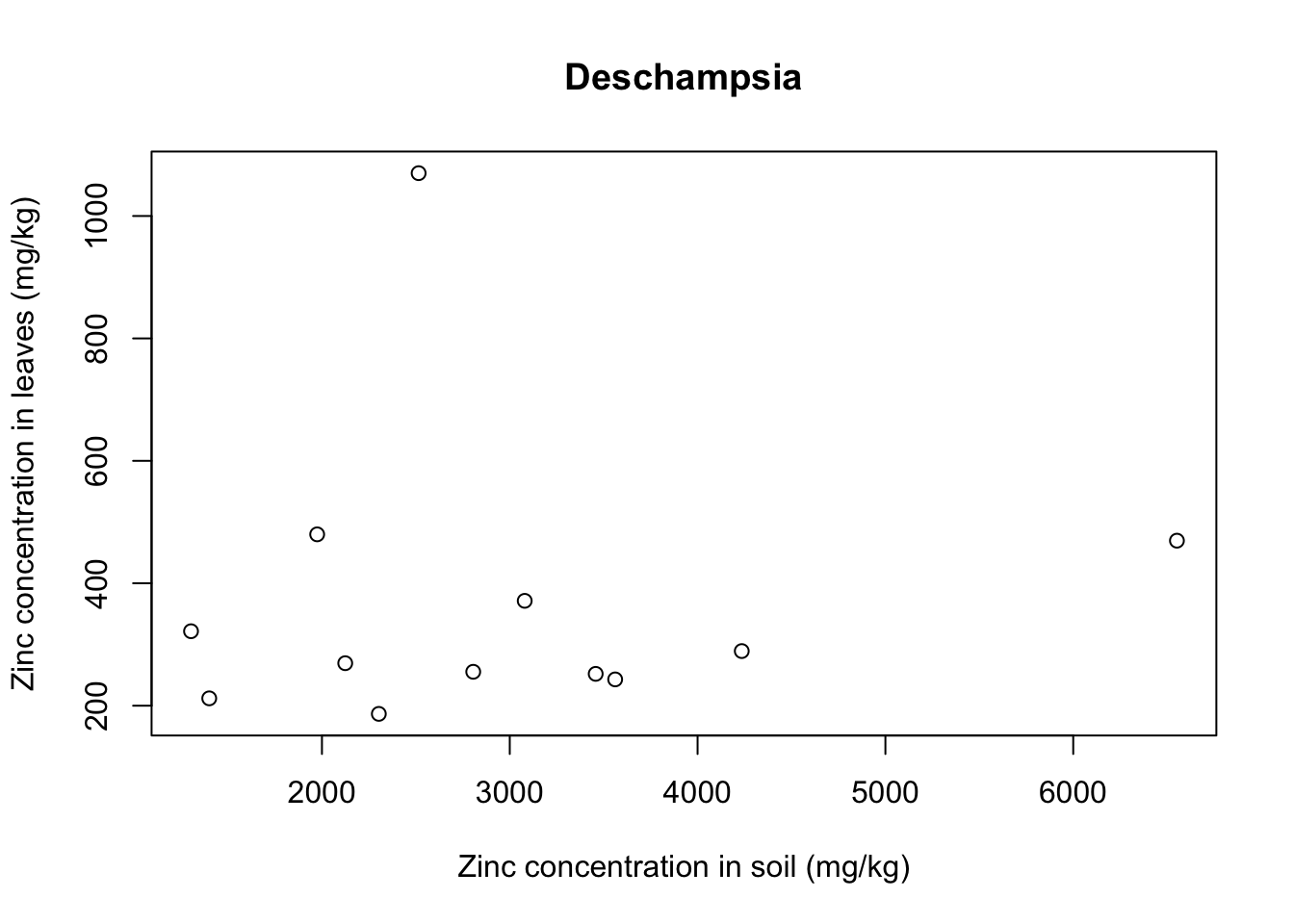
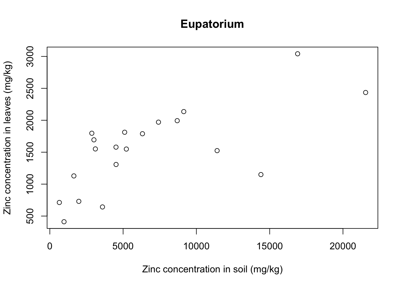
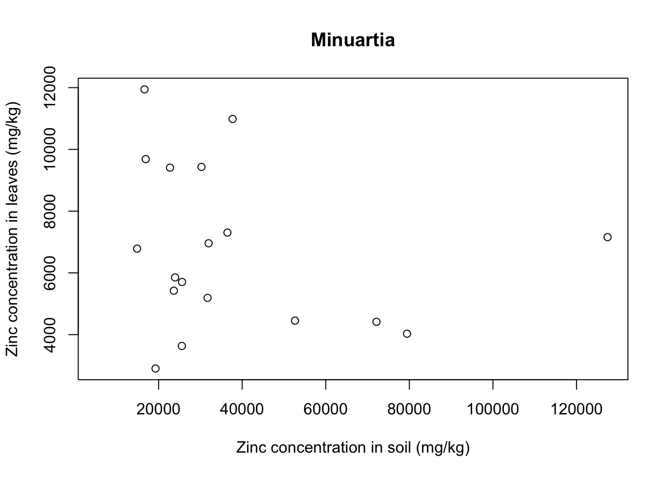
With that we see that each plant species has a somewhat different relationship between soil and leaf concentrations of metal. Remember that this is a small sample dataset, and not the complete dataset from Lee’s paper, so our plots are merely illustrative and do not necessarily reflect real results.
Barplot
Barplots show only the mean of a variable and an error bar, so they are not the most informative type of graph. Most often they can be completely replaced by a boxplot, which is way more informative. Still, barplots are common out there and you might want to know how to plot it in R, so here goes an example.
First, you need to summarize the information of your dataset to get the mean and the standard error, and then you will use this new data frame to plot.
Create a function to calculate the standard error - this is the same as we did last week:
se <- function(x) {
  sd(x)/sqrt(length(x))}
Calculate the mean and standard error of zinc concentrations for each species, and save that into a new data frame:
for_barplot <- with(data = heavy_metals,
                    aggregate(formula = Leaves_Zinc ~ Species,
                              FUN = mean)) # Summarize mean by Species

colnames(for_barplot) <- c("Species", "Mean_Zinc") # Change name of columns

for_barplot$SE_Zinc <- with(data = heavy_metals,
                            aggregate(formula = Leaves_Zinc ~ Species,
                                      FUN = se))[,2] # Summarize SE

for_barplot
## Species Mean_Zinc SE_Zinc
## 1 Ageratina 1217.2924 207.96135
## 2 Agrostis 1195.8129 132.61932
## 3 Deschampsia 376.2118 51.12984
## 4 Eupatorium 1533.0363 137.28854
## 5 Minuartia 6450.6295 591.22250Now we can use the command barplot:
barplot(formula = Mean_Zinc ~ Species,
        data = for_barplot,
        ylab = "Zinc concentration in leaves (mg/kg)",
        xlab = "",
        ylim = c(0,8000)) # Extend y axis to higher values to fit the error bar
You can see the error bars are not there. In base R, you have to improvise with the arrows function. After plotting the core graph, you overlay arrows in the plot, while making the arrow head horizontal instead of pointy:
barplot(formula = Mean_Zinc ~ Species,
        data = for_barplot,
        ylab = "Zinc concentration in leaves (mg/kg)",
        xlab = "",
        ylim = c(0,8000))

arrows(y0 = for_barplot$Mean_Zinc-for_barplot$SE_Zinc, # y0 and y1 are the mean minus or plus the SE
       y1 = for_barplot$Mean_Zinc+for_barplot$SE_Zinc,
       x0 = c(0.7,1.9,3.1,4.3,5.5), # Position in x would usually be 1:5 because 5 categories
       x1 = c(0.7,1.9,3.1,4.3,5.5), # but barplot is weird and moves the x labels a bit
       angle = 90, # Angle of the arrow head
       code = 3, # Arrow head in one side (1), other side (2), or both sides (3)
       length = 0.1) # Length of the horizontal bar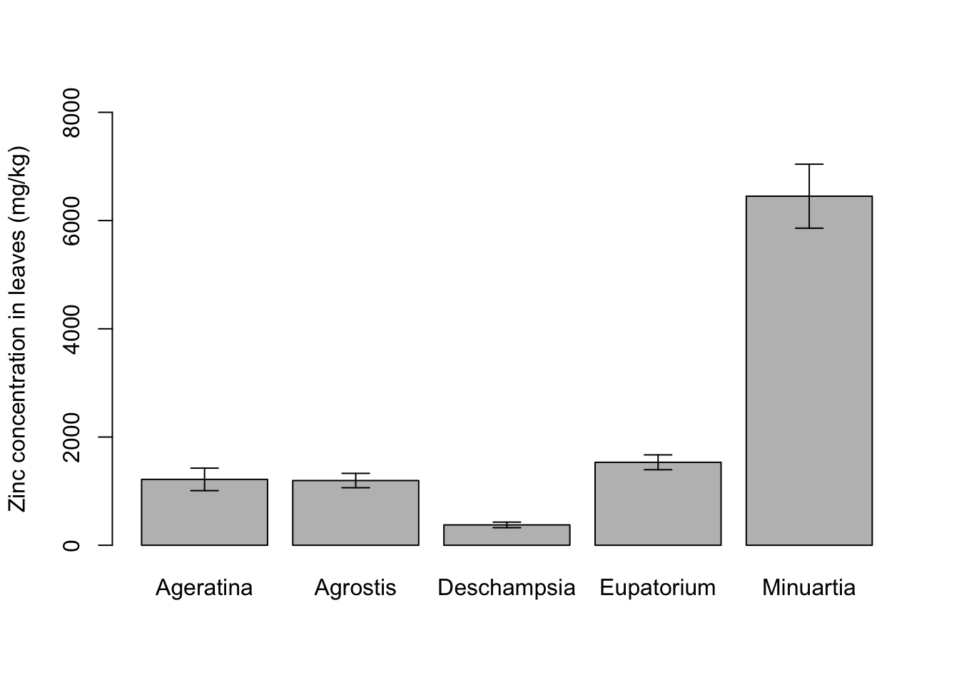
Customization with base R
There are many other types of plots available in base R, and many more options for customization, for example colors, margins and panels with multiple plots. Below is one panel example with multiple plots and customizations.
For more examples and details on customization of base R graphs, check the help page of the command par and also this and this websites as starting points. Help pages and google are your best friends to customize R plots.
# output omitted to keep tutorial clean
colors() # existing colors in base R
?points # symbols
?par # graphic paremeters
palette.pals() # several new palettes added as of R v4.0.0## [1] "R3" "R4" "ggplot2" "Okabe-Ito"
## [5] "Accent" "Dark 2" "Paired" "Pastel 1"
## [9] "Pastel 2" "Set 1" "Set 2" "Set 3"
## [13] "Tableau 10" "Classic Tableau" "Polychrome 36" "Alphabet"Multiple customized plots
Create a data frame to hold colors and symbols for each species:
plant_colors <- data.frame(Species = factor(levels(heavy_metals$Species)),
                           Color = c("darkgreen", "darkorange",
                                     "deepskyblue", "firebrick", "darkviolet"),
                           Symbol = c(7,19,24,0,8))
plant_colors
## Species Color Symbol
## 1 Ageratina darkgreen 7
## 2 Agrostis darkorange 19
## 3 Deschampsia deepskyblue 24
## 4 Eupatorium firebrick 0
## 5 Minuartia darkviolet 8Let’s make a 2x2 panel and fill the slots with the same graphs we created above, a histogram, a boxplot, a scatter plot and a barplot. Use the help function to explore each command that is not yet familiar to you:
par(mfrow = c(2,2)) # mfrow: panel of 2x2 plots, ordered by row

# Histogram
hist(heavy_metals$Soil_Zinc,
     breaks = 20,
     main = "",
     xlab = "Zinc concentration in soil (mg/kg)")

# Boxplot
boxplot(formula = Leaves_Zinc ~ Species,
        data = heavy_metals,
        col = plant_colors$Color,
        xaxt = "n", # Suppress the x axis completely
        ylab = "Zinc concentration in leaves (mg/kg)",
        xlab = "",
        main = "Boxplots are better than barplots:")

text(x = 1:5, y = -1200, # Position to add labels in x axis
     labels = for_barplot$Species, # Text to add
     xpd = TRUE, # Enable text outside the plot region
     srt = 15) # Angle

mtext(text = "GOOD INFO/INK RATIO",
      side = 3, # Side of graph
      col = "firebrick",
      cex = .8) # Size of text

# Scatter plot
plot(formula = Mycorrhizal_Colonization*100 ~ Soil_Zinc,
     data = heavy_metals,
     col = palette.colors(n = 5, "Dark 2"),
     pch = plant_colors$Symbol,
     ylab = "Root colonization by fungi (%)",
     xlab = "Zinc concentration in soil (mg/kg)")

mtext(text = "Different color palette just to illustrate",
      side = 4,
      col = "firebrick",
      cex = .8)

## text() - adds text to plot
## mtext() - adds text into one of the four margins of the plot

# Barplot
barplot(formula = Mean_Zinc ~ Species,
        data = for_barplot,
        col = plant_colors$Color,
        xaxt = "n",
        ylab = "Zinc concentration in leaves (mg/kg)",
        xlab = "",
        ylim = c(0,8000))

text(x = c(0.7,1.9,3.1,4.3,5.5),
     y = -500,
     labels = for_barplot$Species,
     xpd=TRUE,
     srt=15)

arrows(y0 = for_barplot$Mean_Zinc-for_barplot$SE_Zinc,
       y1 = for_barplot$Mean_Zinc+for_barplot$SE_Zinc,
       x0 = c(0.7,1.9,3.1,4.3,5.5),
       x1 = c(0.7,1.9,3.1,4.3,5.5),
       angle=90,
       code=3,
       length = 0.1)

mtext(text = "BAD INFO/INK RATIO",
      side = 3,
      col = "firebrick",
      cex = .8)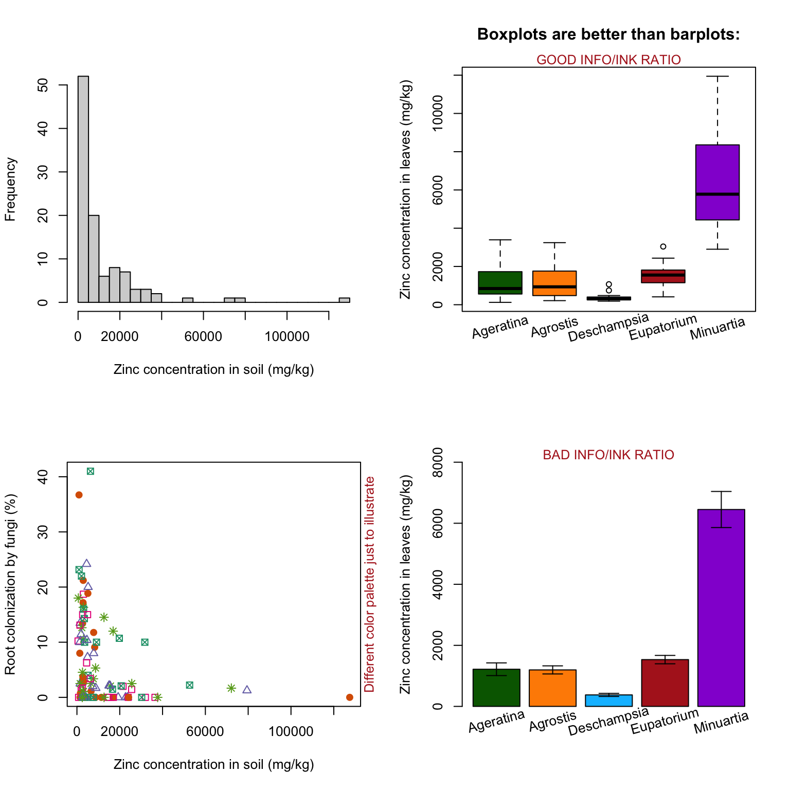
Remember to set your graphic device back to 1x1, otherwise all of your next plots will be shown in the smaller slots of your previous 2x2 device:
par(mfrow = c(1,1)) # Set graphic device back to 1 plot onlySave basic plots to file
Basic graphs can be saved with functions like pdf, png, tiff or jpeg, which open an external graphics device to save your figure. The graph will not show on your RStudio window, but it will be automatically saved in your working directory. After the pdf command, you list your plotting commands, followed by closing the device with dev.off:
pdf(file = "baseRhist.pdf", # Open pdf device
    width = 5,
    height = 5) # Size of figure in inches

hist(heavy_metals$Soil_Zinc,
     breaks = 20,
     main = "Zinc concentrations (mg/kg)",
     xlab= "Soil")

dev.off() # Close device
## quartz_off_screen
## 2The above was a short example with only one histogram, but you can have many plots in between the pdf and the dev.off commands. Now go back and use these two commands on the 4-plot panel above (remember that anything needed for the plot, including the par command, needs to be contained in between pdf and dev.off). Suggested arguments for opening your pdf device: file = "baseRpanel.pdf", width = 8, height = 8
ggplot2
Although the R built-in functions can be sufficient for many purposes, there are several graphical packages that allow more flexibility and simplicity when plotting elaborate graphs. ggplot2 is arguably the most used R tool for creating graphs nowadays.
One major difference in the usage of ggplot2 is the syntax. The system for adding plot elements is based on building blocks, layers that you put together to create and edit any graph. Compared to base graphics, ggplot2 can be more verbose for simple graphics, but much less verbose for complex graphics. The data should always be in a data frame. The basic structure is: ggplot(dataset) + geom_() + theme()
where the first part calls an empty plot with the specified dataset, then each layer for customization is added with a + sign. There are many geom_ functions available, as we will see below.
You can find information on all ggplot2 commands in this Reference page, and a cheatsheet for the most used functions.
With the package loaded, you can also call help for the new functions that came with ggplot2:
?ggplotLet’s try all the same types of graph that we built with base R.
Histogram
Step by step, let’s see what the parts do:
ggplot(data = heavy_metals) # Just an empty plot, but holds the data to be used
Aesthetics
Now we specify the set of aesthetics that will be used throughout the following layers (the information is said to be inherited by the next commands). Aesthetic (aes) are mappings of a visual element to a specific variable, for example: the position of the data (on the x and y axes), a color pattern that follows the factor levels of a variable.
ggplot(data = heavy_metals, #  Dataset
       aes(x = Leaves_Zinc)) + # Variable specified to the x axis
  geom_histogram(bins = 20, na.rm = TRUE) # Specify histogram type of plot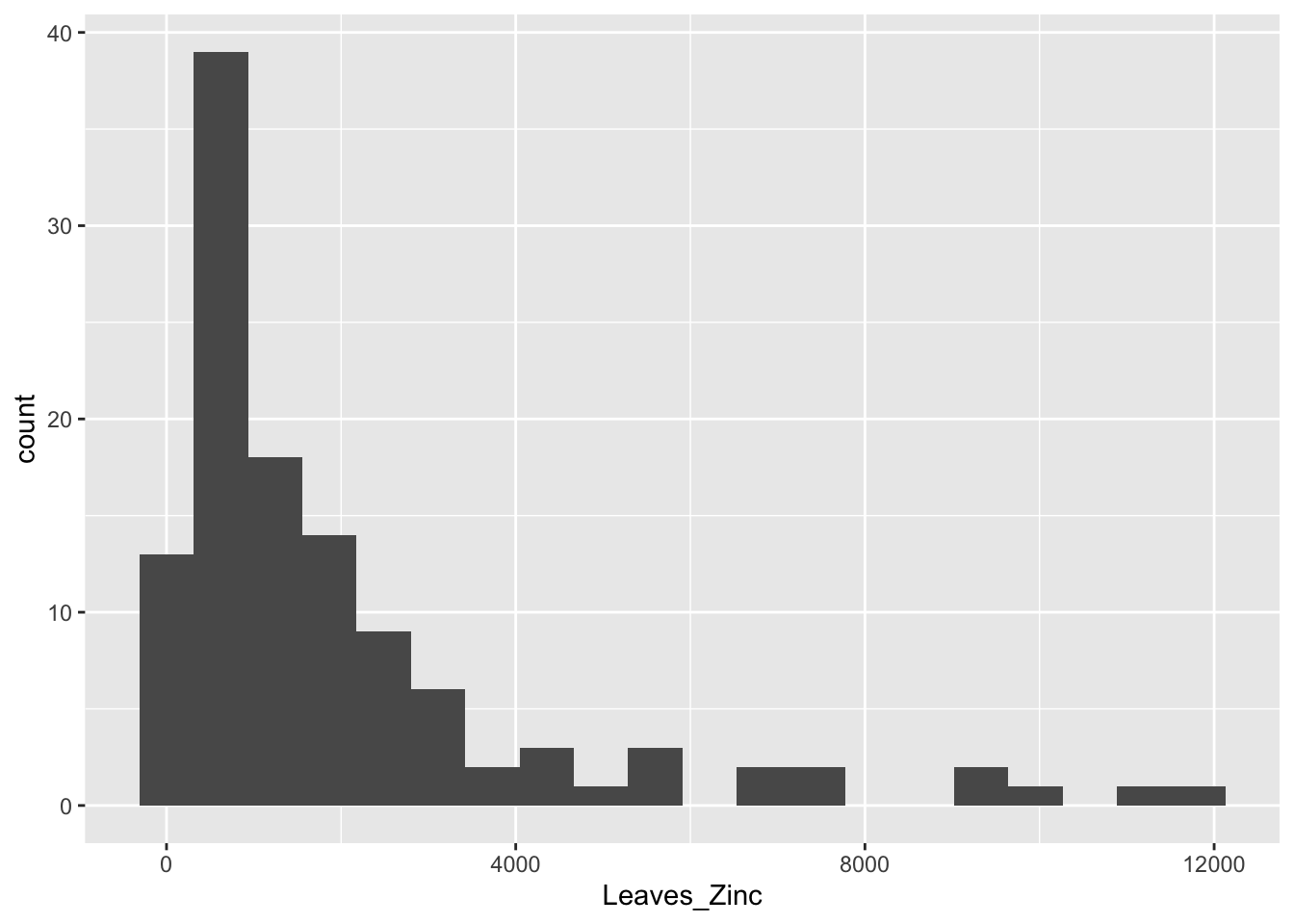
Default themes
The theme_ command has several default, nice-looking themes to change background colors and patterns. Also use the function labs to change the names of the axes:
gghist <- ggplot(data = heavy_metals,
                 aes(x = Leaves_Zinc)) +
  geom_histogram(bins = 20, na.rm = TRUE) +
  theme_minimal() + # Various default themes
  labs(x = "Zinc concentration in plant leaves (mg/kg)",
       y = "Frequency") # Titles

gghist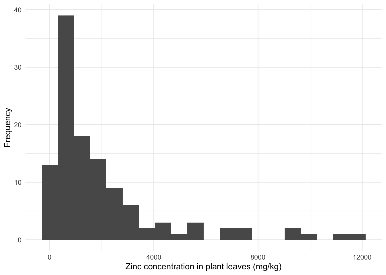
Boxplot
Here we add the y aesthetics, so that we can specify both the zinc concentration and the species as variables. You can also add aesthetics not on the ggplot command, but on the geom_ function of the specific type of plot, in which case the aesthetics are not inherited by other layers. For this particular boxplot, not inheriting the data does not matter, because none of the following layers need the data itself.
ggplot(data = heavy_metals) +
  geom_boxplot(aes(y = Leaves_Zinc, # Boxplot with variables in aesthetics
                   x = Species), na.rm = TRUE) +
  theme_minimal() +
  labs(x = "", y = "Zinc concentration in plant leaves (mg/kg)")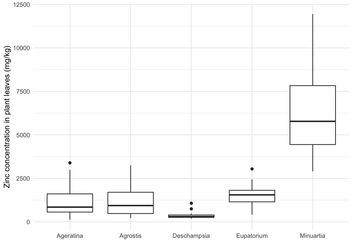
Mapping color aesthetics
Add color to the border and fillings of the boxes according to a variable (in this case, the Species):
ggplot(data = heavy_metals) +
  geom_boxplot(aes(y = Leaves_Zinc,
                   x = Species,
                   col = Species, # New color aesthetics (outline and filling)
                   fill = Species), na.rm = TRUE) +
  theme_minimal() +
  labs(x = "", y = "Zinc concentration in plant leaves (mg/kg)")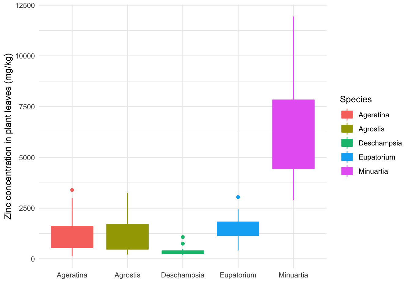
But the fill hides the value of the median. We can make the fill color transparent in the geom_ function (visual attributes with a fixed value are set outside of the aes command because they do not follow a variable). We can also change the color scheme with scale_ functions:
ggplot(data = heavy_metals) +
  geom_boxplot(aes(y = Leaves_Zinc,
                   x = Species,
                   col = Species,
                   fill = Species),
               na.rm = TRUE,
               alpha = 0.5) + # Transparency
  theme_minimal() +
  labs(x = "", y = "Zinc concentration in plant leaves (mg/kg)") +
  scale_fill_brewer(palette = "Dark2") + # Color palette for the fill
  scale_color_brewer(palette = "Dark2") # and for the borders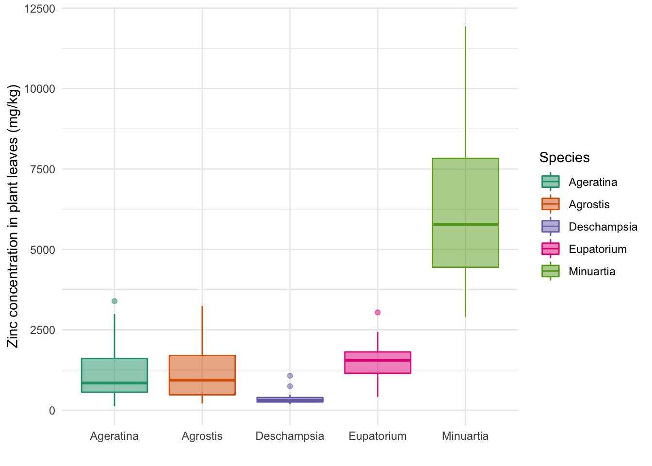
Color Brewer
The website Color Brewer is great for finding palettes for different types of data (e.g. discrete, continuous), including options that are color-blind safe. You can pick colors manually or get the names of the palettes to use in the scale_ functions.
Also check the help to find palettes names without going to the website:
?scale_color_brewerTheme elements
The theme function allows you to edit all kinds of elements of the plot that are not the data itself, such as
- legends
- fonts of axis
- titles
- background
In this graph, we don’t need the legend, so we can remove it. It would also be nice to italicize the names of the genera, and make them fit better to the graph by setting the words at an angle.
ggbox <- ggplot(data = heavy_metals) +
  geom_boxplot(aes(y = Leaves_Zinc,
                   x = Species,
                   col = Species,
                   fill = Species),
               na.rm = TRUE,
               alpha = 0.5) +
  theme_minimal() +
  labs(x = "", y = "Zinc concentration in plant leaves (mg/kg)") +
  scale_fill_brewer(palette = "Dark2") +
  scale_color_brewer(palette = "Dark2") +
  theme(legend.position = "none", # Remove legend
        axis.text.x = element_text(face = "italic", # Make names italic
                                   size = 12, # Increase font size for x labels
                                   angle = 15)) # Angle of x labels

ggbox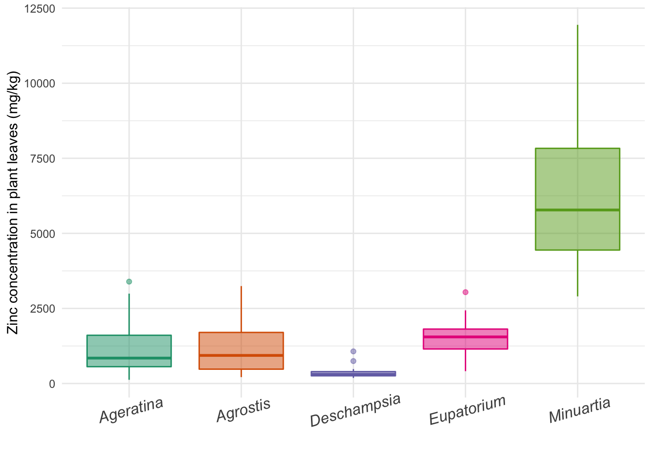
Scatter plot
Below we recreate the scatter plot of how zinc concentration of leaves relates to concentration in the soil. With base R, we used a for loop to create one plot per species. Let’s use the aesthetics of ggplot2 to differentiate the points of each Species by color, in the same plot. We are also going to explore more arguments of the theme function:
ggpoint <- ggplot(data = heavy_metals,
                  aes(x = Soil_Zinc, y = Leaves_Zinc)) + # Aesthetics for x and y
  geom_point(aes(col = Species, # Color aestethics for the points
                 fill = Species),
             na.rm = TRUE,
             pch = 22, # Symbol to be used (see ?points)
             size = 3) + # Size of points
  theme_minimal() +
  theme(axis.title = element_text(size = 11), # Title of both axes
        legend.text = element_text(face = "italic", size = 11), # Italics in the legend
        legend.position = "top", # Legend on top of graph
        legend.title = element_blank()) + # Remove title of legend
  scale_fill_brewer(palette = "Dark2") +
  scale_color_brewer(palette = "Dark2") +
  labs(x = "Zinc concentration in soil (mg/kg)",
       y = "Zinc concentration in leaves (mg/kg)")

ggpoint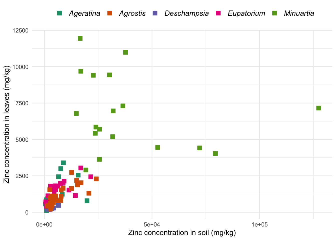
Barplot
We already saw how barplots are little informative compared to other types of plots, but for the sake of the comparison with base R, let’s create a barplot with ggplot2 as well.
ggbar <- ggplot(data = heavy_metals,
                aes(y = Leaves_Zinc, x = Species,
                    col = Species, fill = Species)) +
  geom_bar(stat = "summary", # Barplot with mean as summary statistics
           fun = "mean",
           na.rm = TRUE) +
  stat_summary(fun.data = mean_se, # Add SE bars
               geom = "errorbar",
               na.rm = TRUE,
               width = .5,
               col = "black") +
  theme_minimal() +
  theme(axis.title.x = element_blank(),
        axis.text.x = element_text(size = 12, face = "italic", angle = 15),
        legend.text = element_text(face = "italic", size = 12),
        legend.position = "none") +
  scale_color_brewer(palette = "Dark2") +
  scale_fill_brewer(palette = "Dark2") +
  labs(x = "", y = "Zinc concentration in leaves (mg/kg)")

ggbar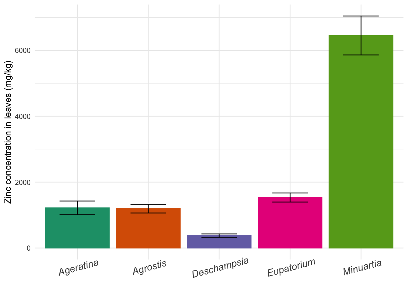
Assign ggplots to objects
Plots made with ggplot2 can be assigned to new objects, as you might have noticed in the examples above where we created gghist, ggbox, ggpoint and ggbar. You can use the object as a shortcut to keep editing the plot with new layers. To exemplify this, let’s add a layer with the command geom_text to label specific points of interest:
# Here we chose to label just a few points
# But you could delete the data argument to label all points in the graph
ggpoint +
  geom_text(aes(label = SampleID), # Aesthetics for the variable containing the text to be added
            data = subset(heavy_metals, Leaves_Zinc > 10000)) # Label subset of points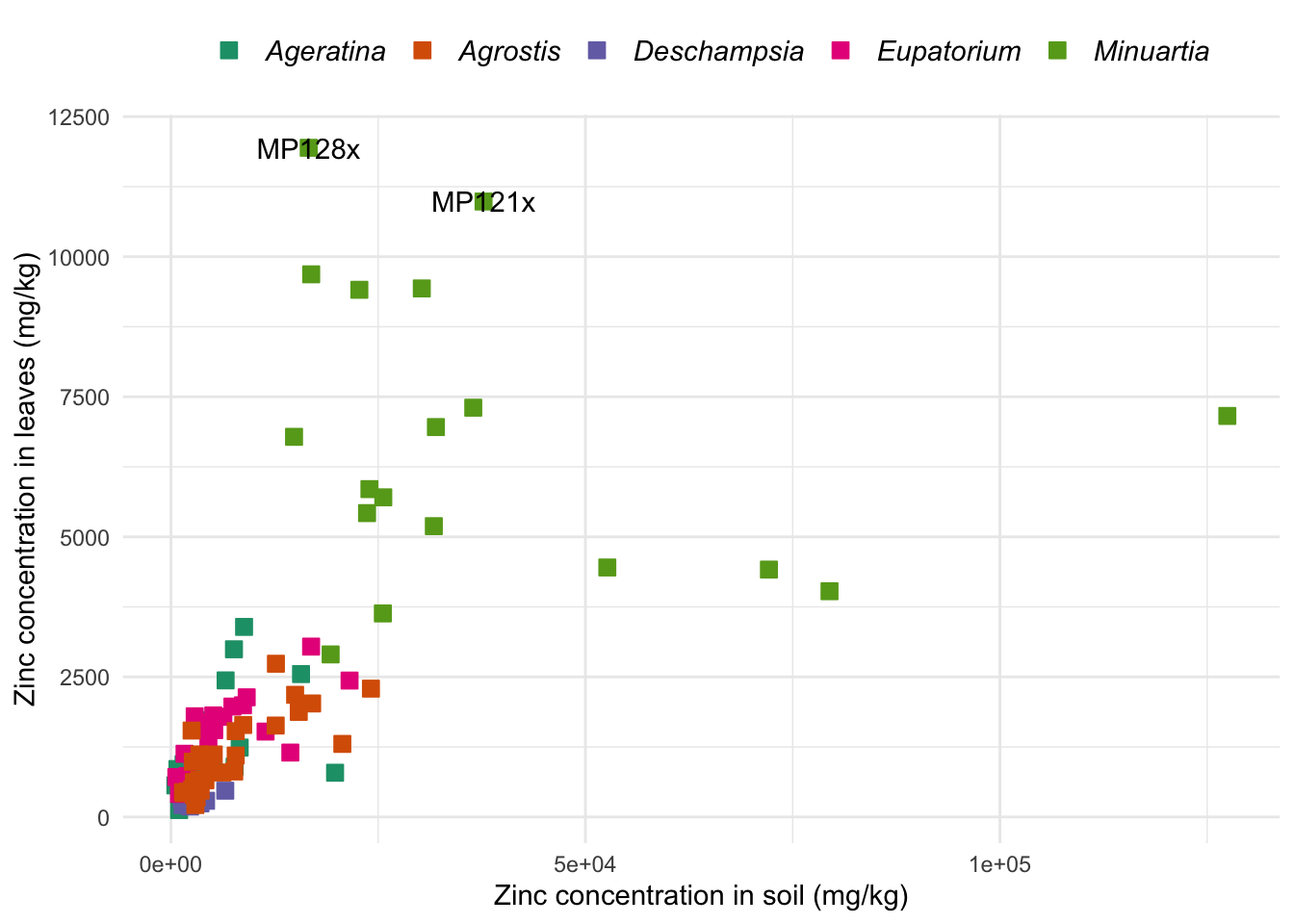
You can update the plot saved in the object at anytime by assigning the new code to the same object name. Let’s save the labels that we just created in the original ggpoint object:
ggpoint <- ggpoint +
  geom_text(aes(label = SampleID),
            data = subset(heavy_metals, Leaves_Zinc > 10000)) +
  theme(legend.position = "none") # Also removing the legend
ggrepel and geom_jitter
In the graph above, the labels are on top of our data points, which does not look very nice. For how to move the labels away from the points, check out the package ggrepel and its function geom_text_repel. You do not need to do this now, just keep this information as a reference for the future.
In other plots where points themselves overlap, you might also want to force a tiny distance between them to improve visualization. ggplot2 can do that with geom_jitter, which adds a small random variation to the actual position of your data. Look it up whenever you need it.
Facet plots
ggplot2 uses facets to easily display several plots of the same kind, each representing a specific level of a categorical variable. Let’s keep working on the zinc data from the scatter plot. We will break it in 5 small windows, one per Species, all in the same figure. To avoid repeating the entire code for the scatter plot, let’s use the ggpoint object again:
ggpoint +
  facet_wrap(~ Species, nrow = 3) + # Wrap plots by Species in 3 rows
  theme(strip.text = element_text(size = 12, face = "italic")) # Title of each small plot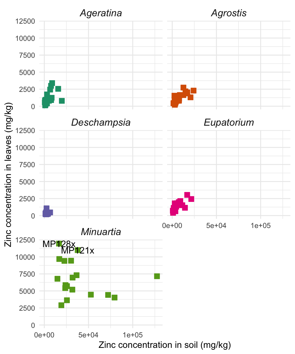
Grid of independent plots
The easiest way to combine multiple plots on a page is the plot_grid function from the package cowplot. For more detail and many more elaborate options, check this website.
First, go back to the four plots we produced with ggplot2 and make sure you assigned them to object names - use gghist, ggbox, ggpoint, ggbar for the names.
As an exercise, practice installing and loading a new package: (Hint: go back to the section on packages of the tutorial)
# GIVE IT A TRY:Now that you have new functions from cowplot available, let’s combine all plots into one panel:
metal_plots <- plot_grid(gghist, ggbox, ggpoint, ggbar, # All plots
          nrow = 2, # Plots distributed in two rows
          align = "h", # Align plots horizontally
          axis = "l", # Side on which to align
          labels = "AUTO", # Place autmatic labels on each plot
          scale = 0.88) # Scale down the size of plots to increase white space in between

metal_plots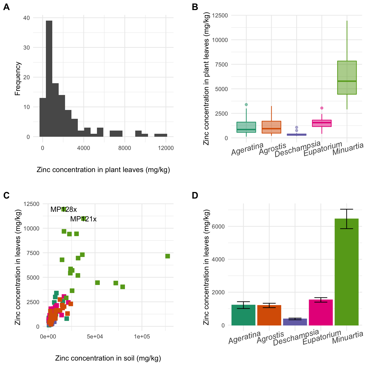
Save ggplots to file
To save a plot to a file in your computer, use the function ggsave and the name of your plot object:
ggsave(filename = "ggplot2panel.pdf",
       plot = metal_plots,
       device = "pdf",
       width = 8,
       height = 8,
       units = "in")
Exercises!
Practice your skills with plotting on another dataset. If you have your own data, get going with your work! Otherwise, use this cool dataset about Himalayan Climbing Expeditions. The members.csv file is available to you in the zipped class material in the Schedule page of the website.
Start with reading the dataset into R, and looking at which variables are present.
# IMPORT AND EXPLORE YOUR DATA- Plot two distinct types of graph (it’s ok to try out other types that we did not see together!). Feel free to use built-in functions or ggplot2. The dataset has many interesting variables, many possible questions to explore. There is no correct answer, you can pick and choose basically anything you like. The only rule is that you have to change, in one or both of the graphs, at least the following:
- axes titles
- any font element in any part of the plot
- color scheme
- some element of the legend
# PLOT 1# PLOT 2- Now combine these two (or more) plots into one figure:
# PANEL WITH MULTIPLE PLOTS- Save your plot(s)
# SAVE